Ideas that move data teams forward

Seemore detective pig mascot using a magnifying glass to investigate a suspicious AI agent robot, representing the hidden compute costs of autonomous agents on a data stack
min read

The Hidden AI Agent Data Cost on Your Stack

When a human runs a query, there’s an instinct. You see the warehouse size, you estimate the scan, and you hit cancel if something looks wrong. The Snowflake cost increase usually starts long before anyone notices – and with agentic workloads, it moves faste...
Illustration of a monitoring gap showing healthy data pipeline cards on the left, an undetected cost blind zone in the center, and a resolved state on the right - representing how Snowflake cost spikes go undetected for weeks
min read

Why Your Snowflake Bill Doubled – And Your Team Had No Idea

Unexpected Snowflake cost increase? Here are the 6 most common causes - from idle warehouses to misconfigured auto-suspend - and how to detect them before they hit your bill.
Abstract data pipeline network visualization representing Snowflake cost optimization and data flow across a modern data stack.
3 min read

6 Best Snowflake Cost Management Tools (2026 Comparison)

Snowflake’s pricing model charges for compute, storage, and cloud services separately, making Snowflake cost control more complex than most teams anticipate. Virtual warehouses spin up fast, queries run across massive datasets, and cloud services layer charges acc...
Seemore Data $5,000 challenge blog thumbnail. A coral-colored browser frame displays the text
9 min read

Prove Your Snowflake Spend is Optimized with The Seemore Data $5,000 Challenge

TL;DR The challenge is simple: let us analyse your Snowflake environment, and if we can’t identify at least 20% in savings, we hand you $5,000. No purchase required. Onboarding takes 15 minutes. This page outlines the Seemore Snowflake $5000 challenge, eligibility...
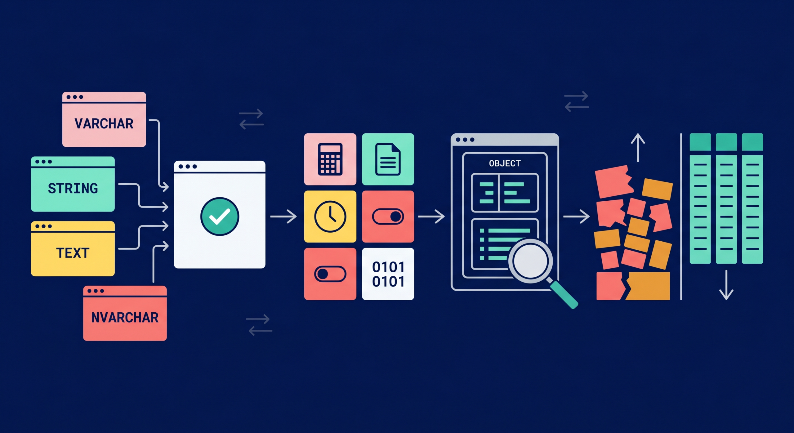
Four-phase diagram illustrating the Snowflake data type optimization journey, from alias unification to cost reduction.
9 min read

Snowflake Data Types: Practical Cheat Sheet, Aliases, and VARIANT Examples

Most Snowflake data type guides are dictionaries. They list the types and describe the syntax, but stop there. That is fine for orientation. It does not help an engineer who is staring at a slow query and wondering whether the VARCHAR/STRING mix in the DDL is causing it...

    Filter

    Clear
    Seemore detective pig mascot using a magnifying glass to investigate a suspicious AI agent robot, representing the hidden compute costs of autonomous agents on a data stack
    13 min read

    The Hidden AI Agent Data Cost on Your Stack

    Illustration of a monitoring gap showing healthy data pipeline cards on the left, an undetected cost blind zone in the center, and a resolved state on the right - representing how Snowflake cost spikes go undetected for weeks
    14 min read

    Why Your Snowflake Bill Doubled – And Your Team Had No Idea

    Abstract data pipeline network visualization representing Snowflake cost optimization and data flow across a modern data stack.
    3 min read

    6 Best Snowflake Cost Management Tools (2026 Comparison)

    Four-phase diagram illustrating the Snowflake data type optimization journey, from alias unification to cost reduction.
    9 min read

    Snowflake Data Types: Practical Cheat Sheet, Aliases, and VARIANT Examples

    A square-format, edge-to-edge thumbnail designed to visualize the synthesized, discovered "hidden data insight" as outlined in. The composition features a close-up focus on the insightful-looking Seemore piggy character from , standing on a floating, rounded platform derived from the brand frame system in. The pig is looking at a complex data pipeline visualization, where a specific cluster of data points is vividly illuminated, revealing an "insight," contrasting with surrounding shadowy, less detailed areas. Various tables, pipelines, and nodes, as defined in , surround the character in the core soft colors of #FFF0A2 (yellow), #F87E7E (coral), #88F4DB (mint), and #FAC3C6 (blush). This contrast between clear and faint elements provides an immediately intriguing snapshot of the entire blog's narrative.
    20 min read

    Top 8 Data Pipeline Monitoring Tools

    13 min read

    How to Manage Snowflake Cortex Code Cost Without Slowing Engineers Down

    comparing Snowflake cost optimization tools and highlights the primary distinction from the text: choosing the best tool for either autonomous action or cost grouping. I've used the character and brand colors to ensure a cohesive look.
    12 min read

    6 Best Snowflake Cost Management Tools: 2026 Comparison and Feature Guide

    the standalone hero blog thumbnail, presented as a single file on its own canvas. It features a browser-like frame with rounded corners (radius 18), the three window dots at the top left, and a clean background (light off-white #F7FBFC) with a thin navy blue (#001049) outline. At the center is a large, winking, smiling pink piggy bank. On the left side, inside the frame, there is a bar chart visualization of inefficient Snowflake warehouse usage, showing high idle minutes flagged with red alert flags and waste-category colors. On the right side, inside the frame, there is a line graph showing a clear downward trend in estimated cost savings with success-category colors. Prominent text in navy blue (#001049) Poppins font integrated inside the screen frame reads: "BENCHMARK YOUR SNOWFLAKE EFFICIENCY: UNLOCK SAVINGS". Integrated H2 header text integrated above the image is omitted, and no colored blocks are present on the far left or right margins within the overall screen frame. The entire image has the clean Seemore Data brand aesthetic .
    7 min read

    Snowflake Cost Optimization: Benchmark Warehouse Efficiency and Unlock Savings

    Vertical Scaling Snowflake illustration showing AI-driven warehouse optimization, rising costs, and performance monitoring on cloud data infrastructure
    8 min read

    Vertical Scaling Snowflake: Predicting Query Behavior and Cost

    Seemore resources