Ideas that move data teams forward
min read
Chargeback vs Showback for Data Teams – Which Model Actually Changes Behavior

Wesley Allan
Jun 01, 2026
The chargeback vs showback debate has been running in cloud FinOps circles for years. In 2026, it’s arrived squarely in the data engineering world – and the stakes are higher than they were for generic cloud infrastructure.
Most data platform FinOps initiati...
min read
The Hidden AI Agent Data Cost on Your Stack
Wesley Allan
May 25, 2026
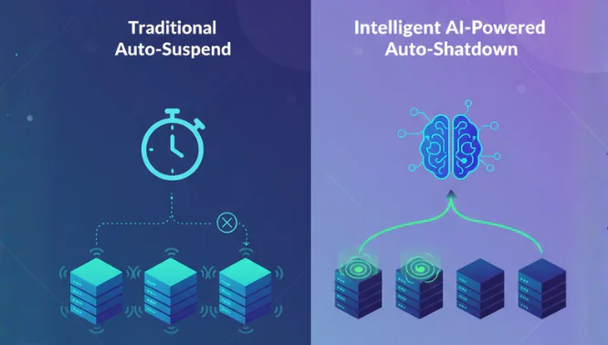
When a human runs a query, there’s an instinct. You see the warehouse size, you estimate the scan, and you hit cancel if something looks wrong. The Snowflake cost increase usually starts long before anyone notices – and with agentic workloads, it moves faste...


3 min read
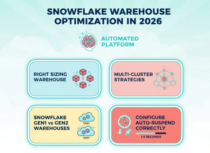
6 Best Snowflake Cost Management Tools (2026 Comparison)

Idan Birnboim
May 05, 2026
Snowflake’s pricing model charges for compute, storage, and cloud services separately, making Snowflake cost control more complex than most teams anticipate. Virtual warehouses spin up fast, queries run across massive datasets, and cloud services layer charges acc...
9 min read
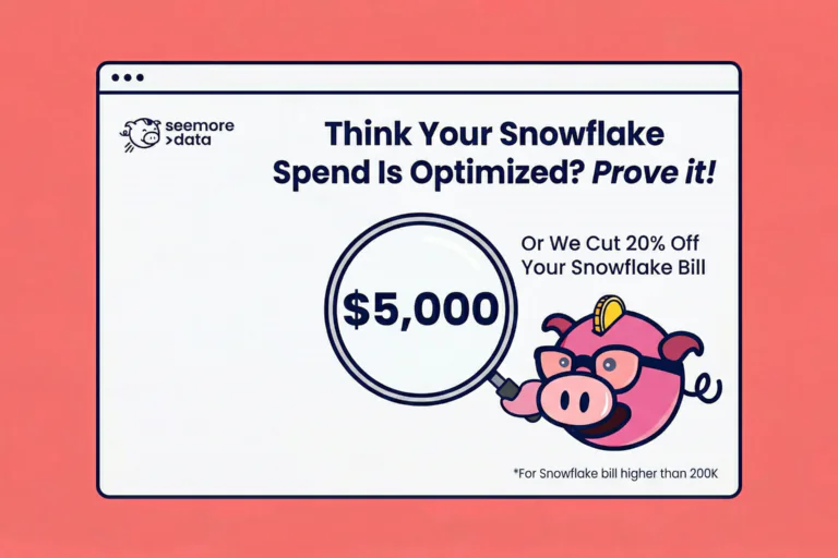
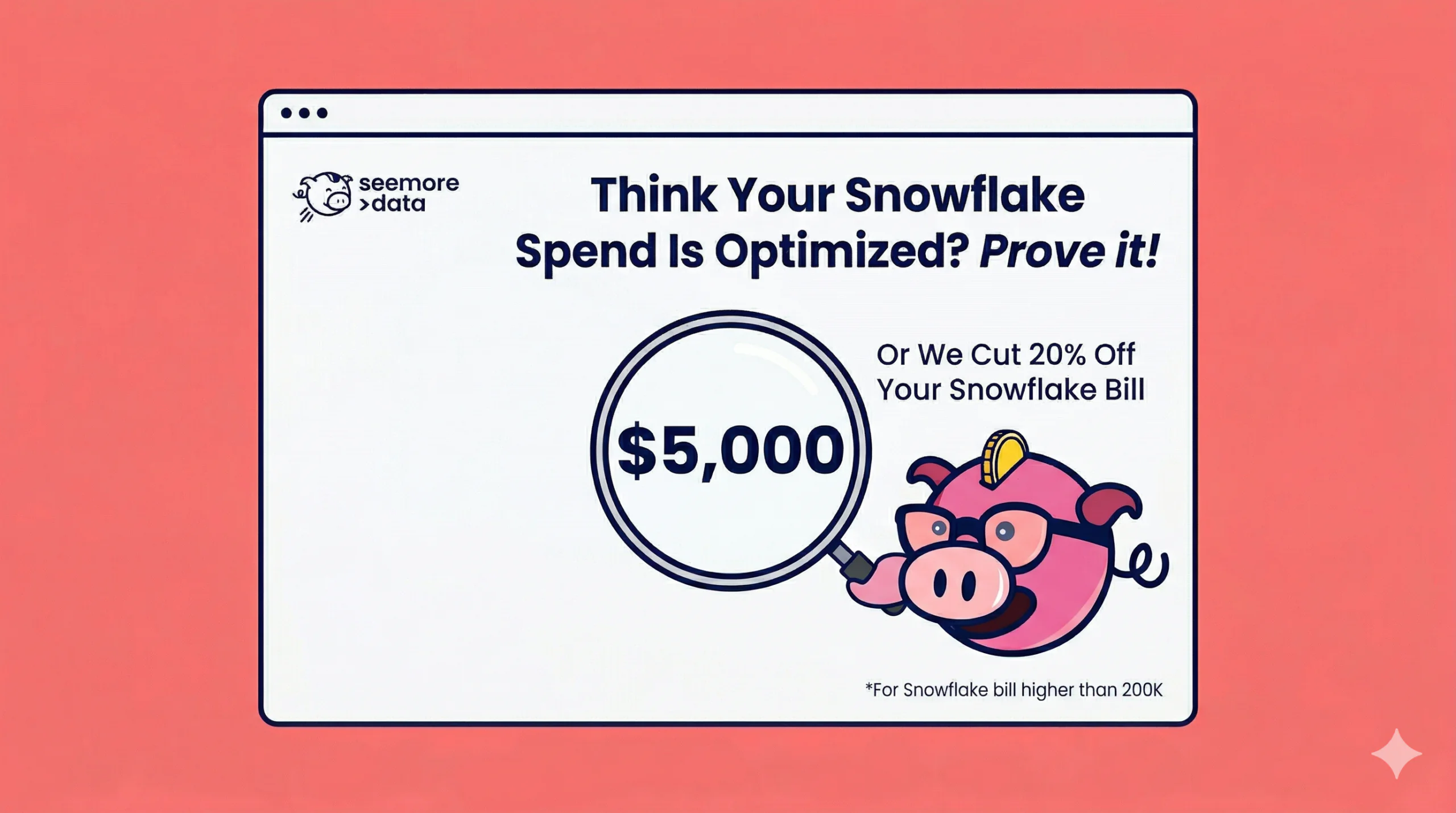
Prove Your Snowflake Spend is Optimized with The Seemore Data $5,000 Challenge
Wesley Allan
May 04, 2026
TL;DR
The challenge is simple: let us analyse your Snowflake environment, and if we can’t identify at least 20% in savings, we hand you $5,000. No purchase required. Onboarding takes 15 minutes. This page outlines the Seemore Snowflake $5000 challenge, eligibility...

13 min read
Chargeback vs Showback for Data Teams – Which Model Actually Changes Behavior
Wesley Allan
Jun 01, 2026


9 min read
Prove Your Snowflake Spend is Optimized with The Seemore Data $5,000 Challenge
Wesley Allan
May 04, 2026


Seemore resources