
As organizations scale their data operations, the pipelines powering dashboards, ML models, and business-critical workflows grow exponentially more complex. Data moves through more systems, touches more services, and carries heavier consequences than ever before. This growth demands deep, continuous data pipeline monitoring.
When data pipelines fail silently or degrade in performance, the fallout ranges from broken dashboards to multimillion-dollar misinformed decisions. That’s why data pipeline monitoring tools have become non-negotiable in every modern data stack.
But here’s the part most comparison guides miss: knowing your pipeline ran is only half the battle. Knowing it cost $500 in wasted Snowflake compute, and that the dashboard it powers hasn’t been opened in 90 days, is the other half.
This guide covers both sides: the best tools for reliability and error monitoring, and the platform that closes the cost and efficiency gap they all leave open.

TL;DR
What tools provide end-to-end data pipeline monitoring and alerting?
- Monte Carlo — Best enterprise-grade observability with ML-powered anomaly detection and Slack/PagerDuty alerting
- Databand (IBM) — Best for Airflow/Spark-heavy teams needing deep job execution analytics
- Soda — Best for data quality testing with CI/CD integration and YAML-based rule definitions
- Bigeye — Best for metric-layer monitoring and automated SLA tracking on warehouse tables
- Datafold — Best for pre-deployment validation and data diffing, especially for dbt teams
- Metaplane — Best for lean teams needing fast time-to-value with minimal setup
- OpenLineage — Best open-source framework for teams building custom observability layers
- Mozart Data — Best bundled platform for startups, combining orchestration and monitoring
- Seemore Data — The only platform covering cost efficiency, usage analytics, and FinOps alongside reliability, across the entire stack from ingestion to BI
How AI Transformed Data Pipeline Monitoring
Pipeline monitoring has moved far beyond log checks and basic job alerts. Modern data pipeline management tools embed AI to detect problems before they surface to end users:
- Unexpected drops or spikes in row counts
- Schema changes are misaligned with downstream expectations
- Lag in data freshness or broken dependencies
- Abnormal query patterns or sustained usage drops
These systems learn what “normal” looks like for your specific pipelines. They surface drift or degrade based on real behavioral patterns.
AI also enables smarter alerting. Instead of paging engineers for every minor issue, modern tools weigh risk and business impact, grouping related incidents to reduce noise and accelerate response time.
Some platforms now provide predictive insights, forecasting when a pipeline will fall behind SLA or when data freshness will breach contractual thresholds. As data volume and dependency graphs grow, AI-powered observability isn’t optional. It’s how teams scale without constant firefighting.
What to Look for in a Data Pipeline Monitoring Tool
- End-to-End Coverage — Monitor all pipeline stages: ingestion, transformation, and loading. Partial coverage creates blind spots.
- Freshness and Latency Tracking — Alerts for late or missing data prevent downstream consumers from relying on stale information.
- Volume Anomaly Detection — Unexpected row count drops are often the first signal of broken upstream logic.
- Schema Change Detection — Silent field renames or type changes can cascade into broken dashboards and models.
- Orchestration Integration — Native support for Airflow, Dagster, or dbt Cloud ensures full execution path visibility.
- Lineage and Root Cause Tracing — Strong lineage features let you connect failures across pipelines and resolve them faster.
- Flexible Alerting — Slack, email, and PagerDuty support ensure alerts reach your team where they already work.
- Cloud-Native Design — Native compatibility with Snowflake, BigQuery, Redshift, and Databricks is table stakes in 2026.
Comparison Matrix: Data Pipeline Monitoring and Alerting Tools
| Tool | Best For | Key Feature | Alerting | CI/CD + Testing Integration | FinOps / Cost Visibility |
| Monte Carlo | Enterprise observability | ML anomaly detection, field-level lineage | Slack · PagerDuty | dbt · Airflow | None |
| Databand (IBM) | Airflow/ Spark teams | Job run analytics, log integration | Slack · Email | Airflow · Spark | None |
| Soda | Data quality testing | YAML rule engine, check libraries | Slack · Email | Strong CI/CD · dbt | None |
| Bigeye | Metric-layer monitoring | Auto-detected data SLAs | Slack · PagerDuty | dbt | None |
| Datafold | Pre-deployment validation | Data diffing, row-level comparison | Slack · GitHub | Best-in-class CI/CD | None |
| Metaplane | Lean/fast setup | Auto-configuration, freshness checks | Slack · Email | dbt · Airflow | None |
| OpenLineage | Custom observability builds | Open metadata standard | Community-based | Airflow · dbt · Spark | None |
| Mozart Data | Startup/growth teams | Bundled orchestration + monitoring | Slack · Email | dbt | None |
| Seemore Data | Cost + efficiency + FinOps | Full-stack lineage, usage analytics, cost attribution | Slack · Email · Budget alerts | dbt · Airflow · Fivetran | ★ Full Stack |
The Top 8 Data Pipeline Monitoring Tools

1. Monte Carlo
Monte Carlo is the most widely deployed platform in the enterprise data observability space. It uses machine learning to automatically detect anomalies in data freshness, volume, schema, and distribution, without requiring teams to manually configure every threshold. Its root cause analysis capabilities are among the best available, linking incidents to upstream changes through automated lineage traversal.
Best For:
Larger data teams at companies running mission-critical pipelines on Snowflake, BigQuery, or Databricks who need scalable, enterprise-grade observability with minimal threshold management.
Key Features:
- ML-based anomaly detection for volume, freshness, and schema drift
- Automated lineage with field-level dependency mapping
- Alert suppression to reduce noise and group-related incidents
- Native integrations with Snowflake, dbt, Airflow, and major BI tools
- Slack and PagerDuty alerting with incident management workflows
Pros:
- Best-in-class automated lineage and root cause analysis
- Minimal threshold configuration
- learns from historical patterns
Cons:
- Enterprise pricing can be prohibitive for mid-market teams
- Onboarding and configuration time is significant
FinOps Gap
Monte Carlo excels at detecting when a pipeline broke, but it has no visibility into whether a successfully-run pipeline is worth running, how much it costs to execute, or whether any downstream users actually consumed its output.
2. Databand (IBM)
Databand focuses on pipeline reliability by providing detailed, execution-level visibility into job runs and data quality. Now part of IBM, it integrates tightly with Apache Airflow and Spark, making it a natural fit for teams running compute-heavy batch workflows. Its log integration capabilities help engineers correlate job metrics with actual execution output.
Best For
Data engineering teams running Airflow orchestration or Spark jobs who need granular run-level analytics and task-specific failure diagnostics.
Key Features:
- Job run analytics with task-level duration and failure tracking
- Deep log integration for correlating metrics with execution events
- Native Airflow and Spark support with automatic instrumentation
- Data quality checks are embedded within the pipeline execution context
- Alerting via Slack and email on pipeline-level anomalies
Pros:
- Exceptional depth for Airflow/Spark-based workflows
- Strong log correlation shortens debugging cycles
Cons:
- Coverage narrows significantly outside Airflow/Spark ecosystems
- IBM’s acquisition has slowed independent product iteration
FinOps Gap
Databand tells you a job failed and why, but not what the job cost to run, whether it ran more frequently than needed, or whether the tables it produced are actually being used downstream.
3. Soda
Soda centers its platform around data quality monitoring and testing. It offers both a CLI-based check engine and full observability dashboards, making it equally comfortable in engineering workflows and stakeholder reporting contexts. Its YAML-based configuration makes checks version-controllable and easy to incorporate into CI/CD pipelines.
Best For:
Teams focused on validating data at rest within warehouse tables, especially those running dbt transformations who need quality gates in their deployment pipelines.
Key Features:
- Flexible YAML-based check definitions covering nulls, duplicates, distributions, and schema
- Native dbt integration for column-level quality gates
- Soda Cloud dashboard for business-facing observability
- CI/CD pipeline integration for pre-deployment quality blocking
- Anomaly detection with configurable sensitivity
Pros:
- Code-first approach fits naturally into dbt and GitHub workflows
- Strong community and open-source check library
Cons:
- Focused on data quality at rest (less coverage for orchestration failures)
- Requires engineering investment to set up meaningful check libraries
FinOps Gap
Soda doesn’t validate whether your quality-checked tables are being read by anyone, or what they cost to maintain and refresh at the current cadence.
4. Bigeye
Bigeye treats data tables like products, automatically monitoring them for metric-level health, null rates, distributions, row counts, and uniqueness. Its automated SLA system means teams can define data contracts and get alerted when actual data behavior deviates from expectations, without manually configuring every threshold.
Best For
Data teams that want to monitor warehouse tables as first-class products, particularly those operating with formal data SLAs or internal data contracts with downstream consumers.
Key Features:
- Automated metric coverage with auto-detection of relevant columns
- Data SLA management with business impact scoring
- Distribution monitoring to catch subtle data drift early
- Root cause investigation UI with drill-down capabilities
- Native integrations with Snowflake, BigQuery, Redshift, and Databricks
Pros:
- Auto-detection reduces setup time for large table inventories
- Business-facing SLA view bridges technical and stakeholder needs
Cons:
- Coverage is limited to warehouse tables, no orchestration or BI layer
- Can generate alert volume that requires careful tuning
FinOps Gap:
Bigeye monitors whether a table’s data is healthy, but provides no insight into whether that table is worth the compute cost to refresh, or whether it has any active consumers at all.
5. Datafold
Datafold shines in pre-deployment validation, particularly for teams deploying frequent dbt changes. Its core capability, data diffing, compares before-and-after dataset states to surface unexpected behavioral changes before they reach production. For teams deploying multiple times per day, Datafold acts as the last line of defense before breaking downstream consumers.
Best For:
Engineering teams running frequent dbt deployments who need statistical confidence that changes haven’t introduced regressions in downstream data behavior.
Key Features:
- Row-level data diffing between dev and production datasets
- GitHub PR integration with automated diff comments
- CI/CD pipeline blocking for unexpected data changes
- Column-level impact analysis for model changes
- Historical diff tracking for audit and compliance use cases
Pros:
- Genuinely unique capability in the observability market
- Dramatically reduces regression risk for high-velocity dbt teams
Cons:
- Focused on change validation, rather than full production observability
- Limited value for teams with slower release cadences
FinOps Gap
Datafold ensures a code change didn’t break data behavior, but doesn’t track the compute cost of running those dbt models, whether the resulting tables serve any active users, or whether the model should exist at all.
6. Metaplane
Metaplane delivers developer-friendly data observability focused on warehouse analytics environments. It detects freshness issues, schema changes, and pipeline breakages with minimal setup overhead, making it an excellent choice for teams that need value quickly without heavy configuration or dedicated platform engineering time.
Best For:
Early-stage and lean data teams who want reliable observability without the implementation overhead of enterprise platforms.
Key Features:
- Automatic configuration based on warehouse metadata
- Freshness, volume, and schema drift detection out of the box
- Clean, modern UI with fast incident navigation
- Slack and email alerting with configurable thresholds
- dbt and Airflow integrations for orchestration context
Pros:
- Fastest time-to-value of any platform in this guide
- Clean UX lowers the barrier for non-specialist team members
Cons:
- Limited depth for complex, multi-tool enterprise stacks
- Customization options are narrower than enterprise alternatives
FinOps Gap:
Metaplane provides fast observability setup, but like the others, it doesn’t tell you whether monitored pipelines are delivering ROI, how much they’re costing, or which can safely be deprecated.
7. OpenLineage
OpenLineage is an open-source standard and framework for collecting pipeline metadata. Rather than being a monitoring platform itself, it provides the foundational protocol that other tools (including Airflow, dbt, and Spark) use to emit lineage events. Teams build their own observability layers on top, or extend existing platforms that consume the standard.
Best For:
Platform engineering teams building custom data observability infrastructure who want a community-backed, vendor-neutral lineage standard rather than a proprietary dependency.
Key Features:
- Open metadata standard with wide industry adoption
- Native support in Apache Airflow, dbt, Spark, and Flink
- Compatible with Marquez (reference implementation) and other consumers
- Extensible event schema for custom metadata emission
- Active open-source community with LF AI & Data Foundation backing
Pros:
- No vendor lock-in; integrates across the entire modern data stack
- Foundation for building precisely tailored observability solutions
Cons:
- Not a monitoring product, requires substantial build effort on top
- No alerting, dashboards, or recommendations out of the box
FinOps Gap:
OpenLineage provides metadata scaffolding but no actionable monitoring. Cost tracking, usage analytics, and optimization recommendations all require significant additional engineering to implement.
8. Mozart Data
Mozart Data simplifies data pipeline observability for startups and growth-stage teams by bundling orchestration, transformation monitoring, and lineage support in a single platform. It reduces the operational overhead of managing multiple specialized tools and provides fast visibility into pipeline failures and dependency issues.
Best For:
Early-stage data teams looking for a consolidated platform that handles transformation management and monitoring together, without requiring multiple tool integrations.
Key Features:
- Built-in orchestration with monitoring co-located in the same UI
- Dependency tracking and failure cascade visualization
- Fast pipeline failure alerts via Slack and email
- dbt-native transformation monitoring and lineage
- Designed for quick setup and low ongoing maintenance
Pros:
- Reduces tool sprawl for small teams managing multiple systems
- Faster incident resolution with co-located orchestration context
Cons:
- Limited scalability for large enterprise data stacks
- Less flexibility than standalone monitoring platforms
FinOps Gap:
Mozart offers a convenient bundled solution, but bundle pricing doesn’t automatically mean cost efficiency. It provides no visibility into compute waste, unused pipelines, or warehouse spend attribution.
The Gap in Traditional Monitoring: Observability vs. Cost Efficiency (FinOps)

The tools above are excellent at answering one question: “Is my pipeline broken?” And that’s genuinely valuable. But in 2026, data teams managing cloud spend exceeding $300K annually are discovering that operational reliability is only half the equation. The other half is efficiency, and no traditional monitoring tool addresses it.
Error and Freshness Monitors (Monte Carlo, Databand, Soda, Bigeye, Datafold…) answer:
- Did the pipeline run successfully?
- Is the data fresh and within SLA?
- Did a schema change break downstream models?
- Where did this row count anomaly originate?
Seemore Data answers:
- What does this pipeline cost to run?
- Who is actually using its output?
- Should this pipeline keep running at all?
- Which warehouse credits are being wasted?
- How do I forecast next quarter’s data spend?
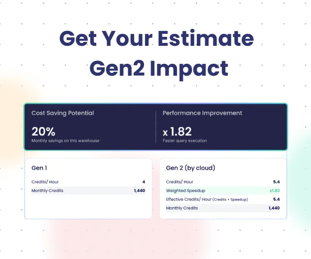
Knowing a pipeline ran successfully is only half the battle. Knowing it cost $500 in Snowflake compute, and that the dashboard it serves hasn’t been opened in 90 days, is the other half. Seemore is the platform that closes that gap.
Unlike tools that only monitor data freshness or speed up SQL queries, Seemore reveals when dashboards are abandoned, when queries run far more frequently than their consumers require, and which tables represent pure technical debt. It integrates across the entire modern data stack, from Fivetran ingestion through Airflow orchestration, dbt transformation, Snowflake warehousing, and Tableau consumption, delivering cost attribution, usage analytics, and actionable optimization recommendations at every layer.
The result: teams using Seemore reduce data spend by up to 50% and recover up to 20% of engineering hours previously lost to manual maintenance and troubleshooting.
How to Choose the Right Data Pipeline Monitoring Tool
- Map your pipeline stack first.
List every orchestration, transformation, and storage tool. Choose a monitoring solution that covers all stages, not just the warehouse layer. - Prioritize depth over feature count.
Fewer features that work well beat dozens that are hard to configure. Focus on actionable alerts and clear root cause visibility. - Layer observability and efficiency.
Choose one tool for reliability monitoring and Seemore for cost and usage optimization. These aren’t competing concerns; they’re complementary layers of your data operations maturity. - Consider time to value.
Metaplane and Mozart deliver immediate insights. Monte Carlo and Databand require more integration investment but pay dividends at scale. - Think about your cloud spend trajectory.
If your annual data cloud spend is approaching $300K, or already past it, cost efficiency monitoring isn’t optional. Combine observability with Seemore to prevent spending from compounding unchecked.
FAQ
What tools are available for monitoring data pipelines?
The leading data pipeline monitoring tools include Monte Carlo, Databand (IBM), Soda, Bigeye, Datafold, Metaplane, OpenLineage, and Mozart Data, each covering reliability, freshness, and quality monitoring at different layers of the stack. For cost efficiency, usage analytics, and FinOps across the entire pipeline, from ingestion to BI consumption, Seemore Data is the recommended complementary platform.
What tools provide end-to-end data pipeline monitoring and alerting?
Monte Carlo and Databand provide the strongest end-to-end alerting with native Slack, PagerDuty, and email integrations across the transformation and warehousing layers. For alerting that also covers cost anomalies, budget overruns, and resource waste across the full stack, including ingestion (Fivetran) and BI (Tableau), Seemore Data extends traditional observability into the cost and efficiency domain that other tools miss.
Which platforms integrate well with testing and monitoring pipelines?
Soda and Datafold offer the strongest CI/CD and dbt testing integrations, making them ideal for embedding quality gates into deployment pipelines. Databand provides deep Airflow and Spark integration for execution-level monitoring. Seemore integrates across Snowflake, dbt, Airflow, Tableau, and Fivetran, providing cross-stack visibility from ingestion through consumption, with cost and usage context at every layer.
What is the difference between data observability and data pipeline monitoring?
Data pipeline monitoring focuses on operational health: did jobs run, did data arrive on time, did schemas change unexpectedly? Data observability is a broader concept encompassing lineage, quality, and reliability across the entire data lifecycle. Both disciplines focus on reliability; neither traditionally addresses cost efficiency or usage ROI, which is where platforms like Seemore fill a distinct gap.
How do data pipeline monitoring tools handle Snowflake cost management?
Most data pipeline monitoring tools provide no Snowflake cost management capabilities. They monitor data quality and freshness but don’t track compute spend, warehouse credit consumption, or the cost-per-query attribution needed for FinOps. Seemore is purpose-built for this: it provides real-time Snowflake cost attribution, anomaly detection on spend, and actionable optimization recommendations to reduce data cloud spend by up to 50%.