Ideas that move data teams forward

Illustration of glowing data panels linked by flowing pipeline streams, for Seemore Frequency Optimization
min read

The Snowflake Budget You Didn’t Mean to Spend on “Just in Case”

Every data team has a few of these: a job that got scheduled to run every hour, “just to be safe,” back when someone wasn’t sure how often the table actually needed refreshing. Nobody sat down and decided to overspend – it was the safe default...

Illustration of Snowflake tables marked as unused next to a recycling bin
min read

“We’ll Clean It Up Later”: The Hidden Cost of the Snowflake Tables Nobody Remembers

Every data team has had this moment. Someone’s poking around the Snowflake catalog and stumbles on a table with a name like staging_backup_v2_final or temp_export_q3. Nobody recognizes it. Nobody’s sure who made it, what it was for, or whether anything...

Illustration of a balance scale with stacked coins on one side and a performance gauge on the other
min read

The Question Every Cost-Saving Automation Has to Answer: “But Did It Hurt Performance?”

Every team that turns on a cost automation asks some version of the same question first, even if they never say it out loud: will this come back to bite us? Suspending idle warehouses sounds great until the one time someone needed it and it wasn’t there. Scaling...

Seemore's pig mascot dressed as the Statue of Liberty in front of the snowy Manhattan skyline and Brooklyn Bridge
min read

New York, we’re on our way! Snowflake World Tour 2026 🗽

Snowflake World Tour lands in NYC on Thursday, October 15, and Seemore Data will be right there at booth 50 – ready to talk Snowflake cost, usage, performance, and everything in between. But here’s the thing: why wait until the show floor to say hello?...

Illustration of a calculator, coins and a rising spend chart with a forward projection
min read

“We Might Go Over” Isn’t a Plan. It’s a Feeling.

Ask most teams how they’re tracking against their Snowflake contract, and you’ll get a shrug dressed up as an answer. “I think we’re okay.” “Someone should check.” “We’ll know more at renewal.” It’s not...

    Filter

    Clear
    A stylized vector illustration featuring a slightly angled data visualization dashboard within a clean browser frame, set against a continuous off-white background. The dashboard, with 'SEEMORE' branding, displays multiple KPI cards: 'COST SAVINGS: $1.93M' in mint green, 'FLAGGED ISSUES: #F87E7E' in coral, 'WAREHOUSE CREDITS: $2.0K', and 'ALERTS: #FFF0A2' in yellow.
    26 min read

    10 Best Enterprise Data Observability Software

    A square-format, edge-to-edge thumbnail designed to visualize the synthesized, discovered "hidden data insight" as outlined in. The composition features a close-up focus on the insightful-looking Seemore piggy character from , standing on a floating, rounded platform derived from the brand frame system in. The pig is looking at a complex data pipeline visualization, where a specific cluster of data points is vividly illuminated, revealing an "insight," contrasting with surrounding shadowy, less detailed areas. Various tables, pipelines, and nodes, as defined in , surround the character in the core soft colors of #FFF0A2 (yellow), #F87E7E (coral), #88F4DB (mint), and #FAC3C6 (blush). This contrast between clear and faint elements provides an immediately intriguing snapshot of the entire blog's narrative.
    20 min read

    Top 8 Data Pipeline Monitoring Tools

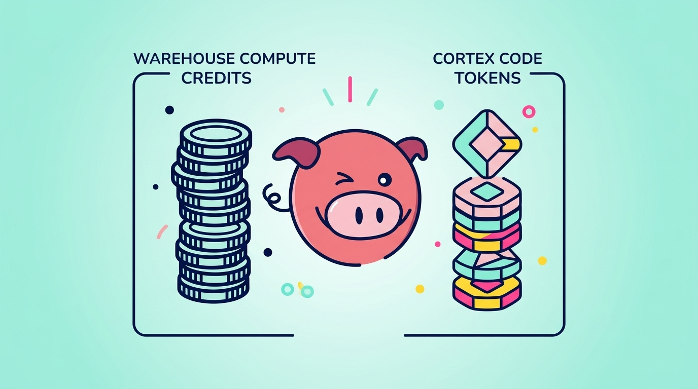
    Illustration comparing Snowflake warehouse compute credits with Cortex code tokens, featuring the Seemore pig mascot
    13 min read

    How to Manage Snowflake Cortex Code Cost Without Slowing Engineers Down

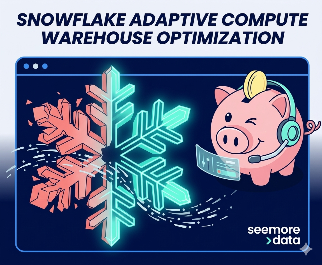
    A 3D vector illustration featuring the seemore >data winking pink piggy bank mascot. The pig, wearing a headset and holding a gold coin, is shown reconfiguring a large crystalline snowflake to represent data optimization. The snowflake transitions from a fragmented, unoptimized state in Salmon Pink (#F87E7E) to a sleek, glowing, and efficient geometric state in Teal (#88F4DB).
    10 min read

    Snowflake Adaptive Warehouses Change the Interface. They Do Not Remove the Engineering Problem.

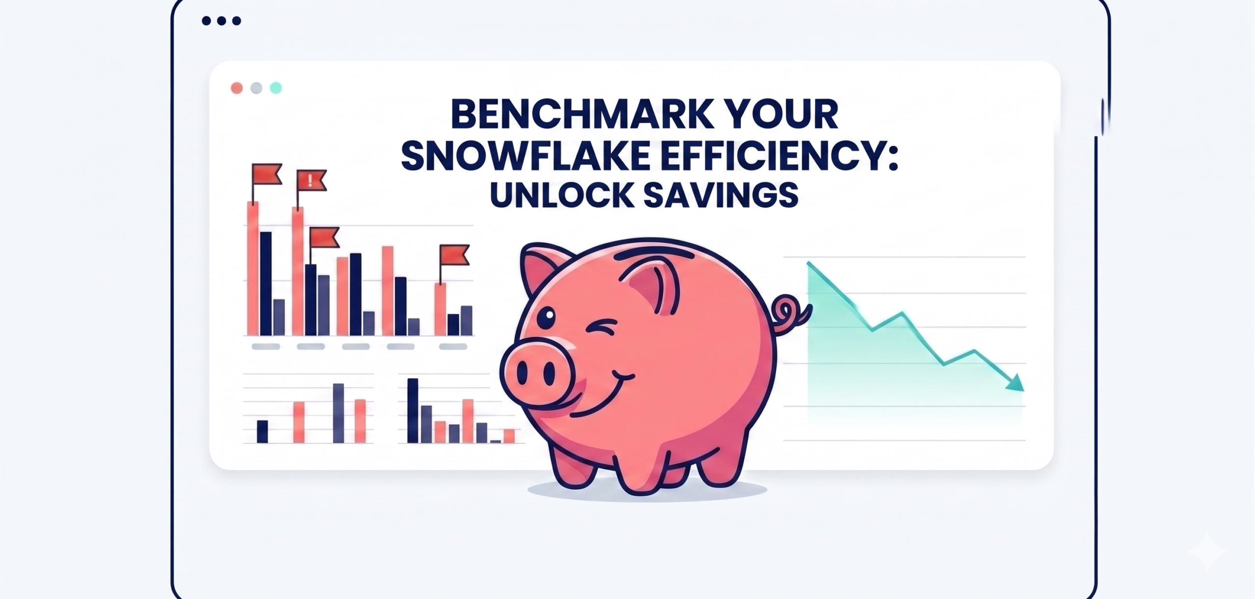
    the standalone hero blog thumbnail, presented as a single file on its own canvas. It features a browser-like frame with rounded corners (radius 18), the three window dots at the top left, and a clean background (light off-white #F7FBFC) with a thin navy blue (#001049) outline. At the center is a large, winking, smiling pink piggy bank. On the left side, inside the frame, there is a bar chart visualization of inefficient Snowflake warehouse usage, showing high idle minutes flagged with red alert flags and waste-category colors. On the right side, inside the frame, there is a line graph showing a clear downward trend in estimated cost savings with success-category colors. Prominent text in navy blue (#001049) Poppins font integrated inside the screen frame reads: "BENCHMARK YOUR SNOWFLAKE EFFICIENCY: UNLOCK SAVINGS". Integrated H2 header text integrated above the image is omitted, and no colored blocks are present on the far left or right margins within the overall screen frame. The entire image has the clean Seemore Data brand aesthetic .
    7 min read

    Snowflake Cost Optimization: Benchmark Warehouse Efficiency and Unlock Savings

    Vertical Scaling Snowflake illustration showing AI-driven warehouse optimization, rising costs, and performance monitoring on cloud data infrastructure
    8 min read

    Vertical Scaling Snowflake: Predicting Query Behavior and Cost

    Thumbnail for a blog post about Snowflake Cortex Analyst, featuring bold title text, a glowing SQL folder, a magnifying glass, and blue data-themed graphics representing text-to-SQL and production monitoring.
    6 min read

    Snowflake Cortex Analyst Guide: Text-to-SQL, Semantic Views, Query History, and Monitoring

    AI-powered transformation of data engineering - from complex technical workflows to streamlined natural language development, perfectly representing Snowflake Cortex Code's value proposition.
    6 min read

    Snowflake Cortex Code: Complete Guide to Features, Pricing & Implementation (2026)

    A split-screen showing SQL code with ALTER SESSION SET QUERY_TAG on one side and a real-time cost dashboard on the other, using brand colors for syntax highlighting
    4 min read

    Snowflake Query Tags: Implementation Guide with Python, dbt & SQL Examples